Name Card design is an important publication, helping to introduce personal or business information to customers and partners. A unique and creative Name Card will help you make a good impression and create sympathy with the recipient.
The role of color in Name Card design
Color is an important element in Name Card design, which can affect the recipient’s emotions and impression. The right color will help your Name Card stand out, attract attention and make a good impression.
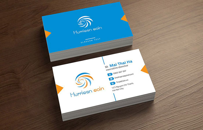
Choose creative colors for Name Card
When choosing creative colors for your Name Card, you need to keep in mind a few things:
Suitable for your industry and business field: Colors need to be suitable for your industry and business field. For example, if you work in a creative or artistic field, you can use bright, youthful colors. If you work in finance or banking, you can use darker colors to show professionalism.
Suitable for target customers: Colors also need to be suitable for your target customers. For example, if you target young customers, you can use bright, youthful colors. If you target business customers, you can use more muted colors to show professionalism.
Matching the brand: Colors need to match your brand. If you already have your own brand, you need to use colors that match that brand.
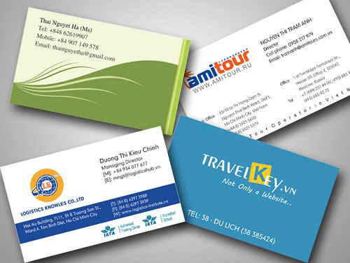
Some suggestions for choosing creative colors for Name Cards
Here are some suggestions for choosing creative colors for Name Cards:
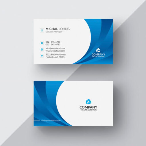
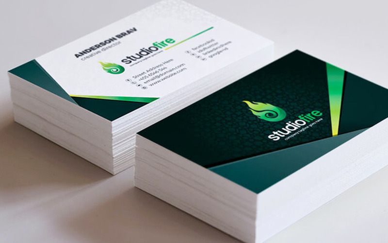
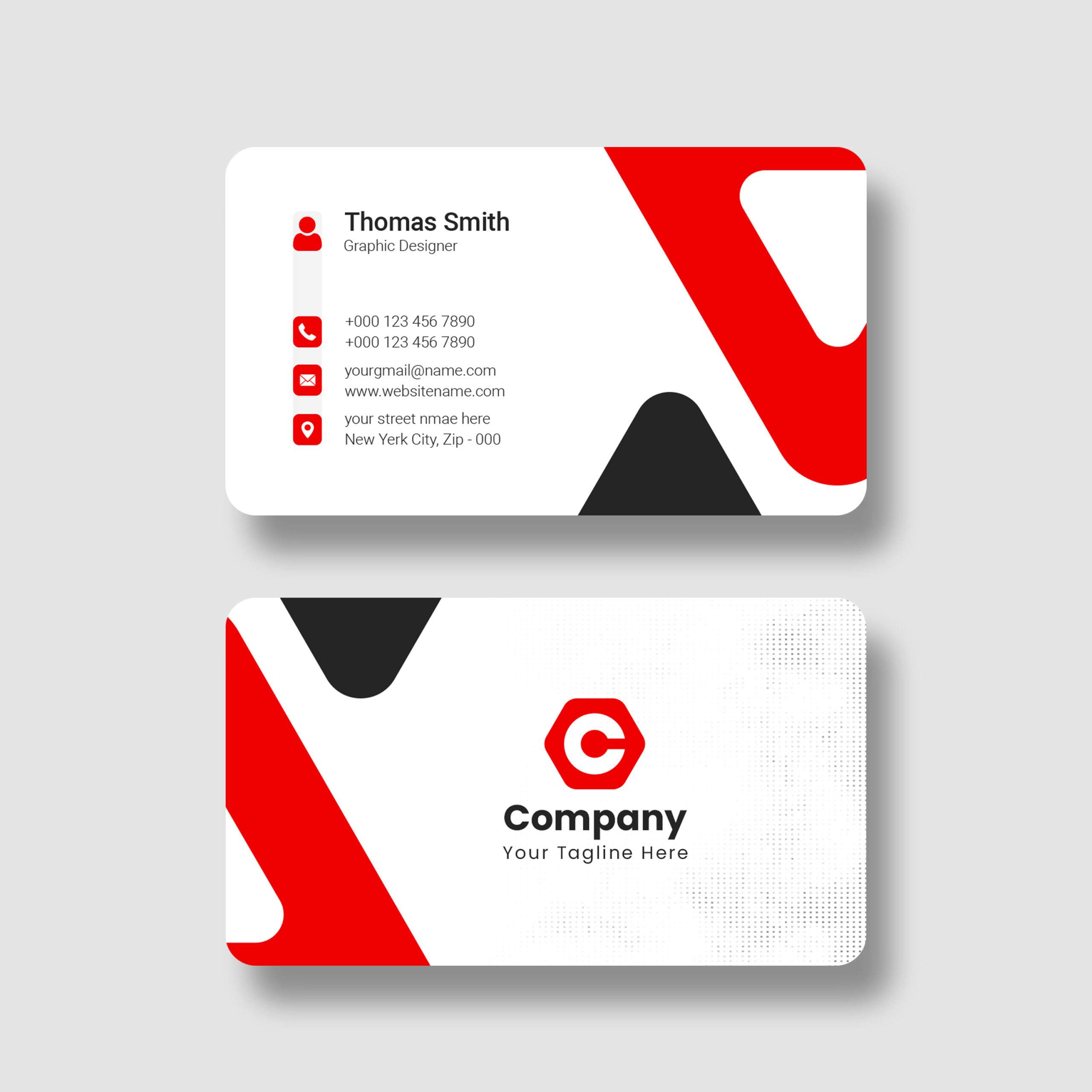
Use contrasting colors: Using contrasting colors will help your Name Card stand out and attract attention. For example, you can use yellow combined with green, red combined with black…
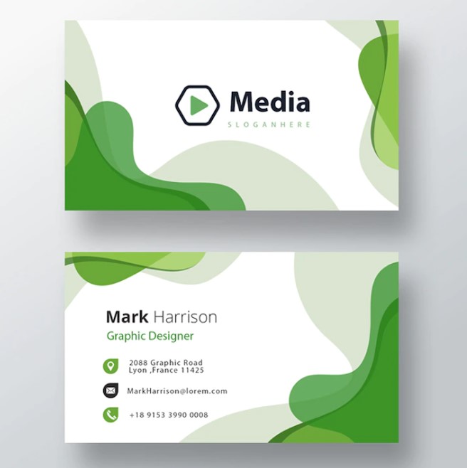
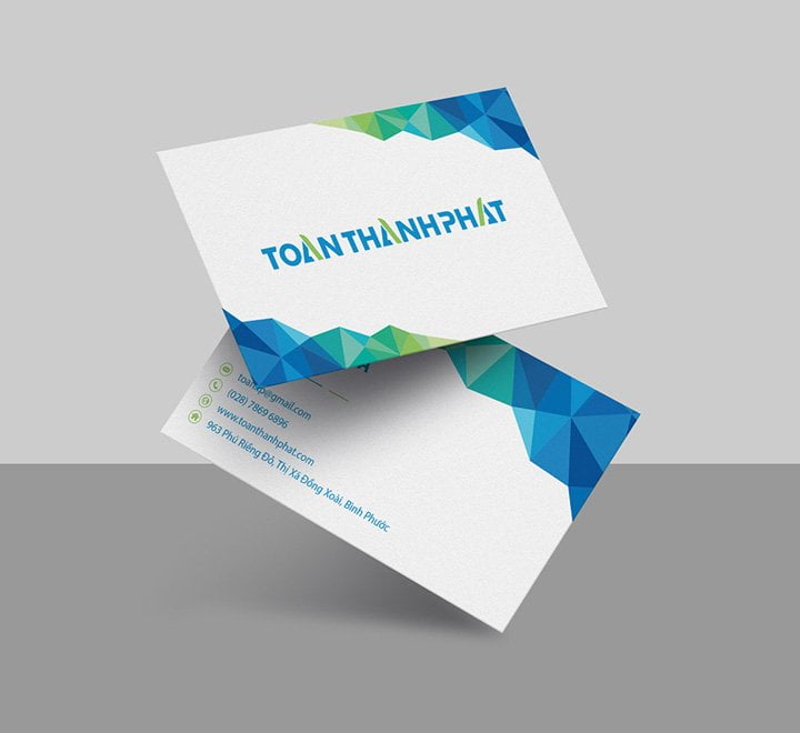
Use pastel colors: Pastel colors are a great choice for young, dynamic businessmen. Pastel colors bring a feeling of lightness, freshness and youthfulness.
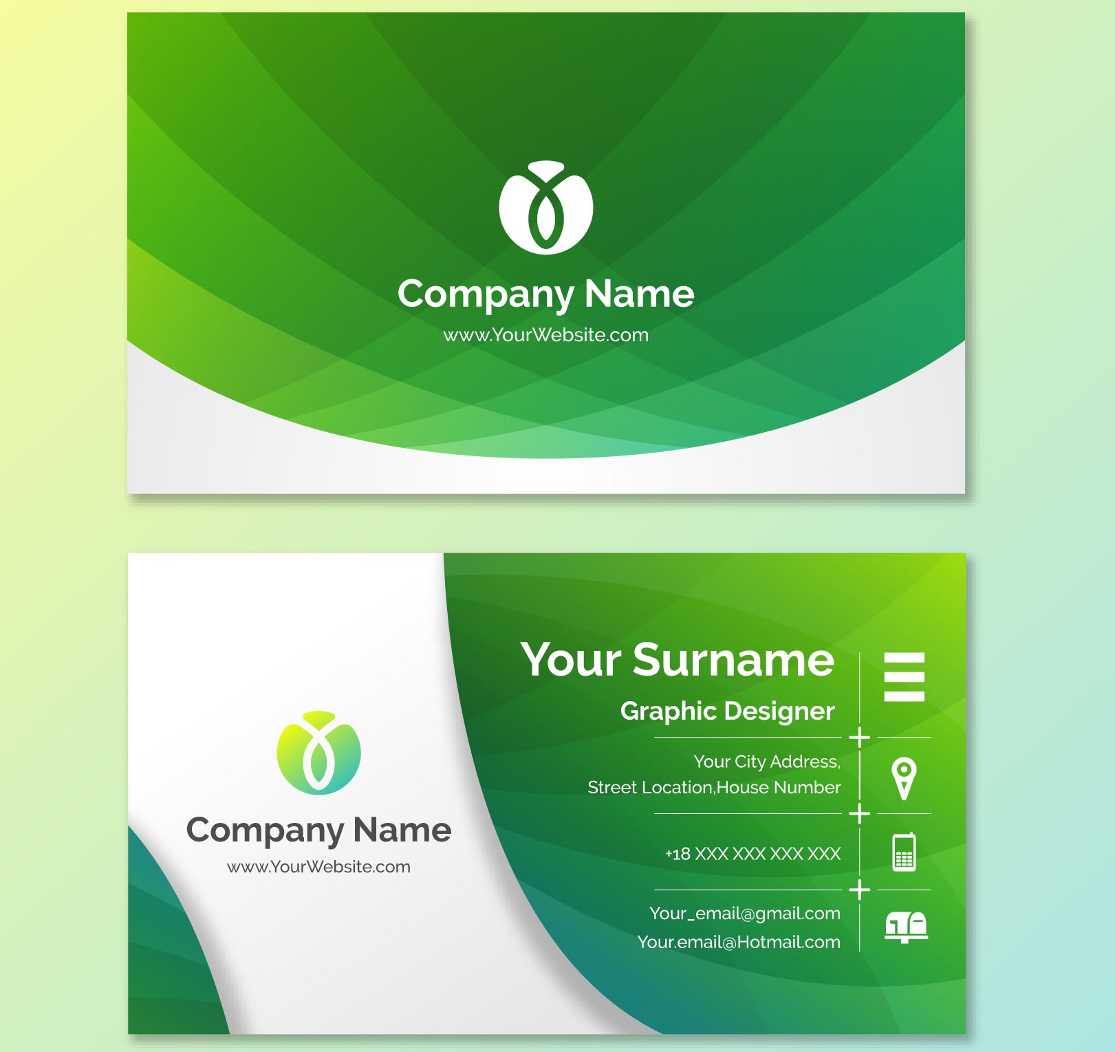
Use ombre colors: Ombre colors are a combination of two or more different colors. Ombre colors bring a unique, creative and impressive feeling.
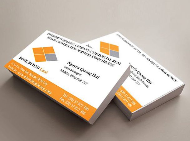
Some notes when choosing creative colors for Name Cards
When choosing creative colors for your Name Card, you need to keep in mind a few things:
Do not use too many colors: Using too many colors will make your Name Card confusing and difficult to see.
Do not use colors that are too bright: Colors that are too bright will cause discomfort to the viewer.
You should use colors that match your target audience: Colors need to match your target audience to make a good impression.
Choosing creative colors is an effective way to design a unique and impressive Name Card. However, you need to pay attention to choosing colors that are suitable for your industry, business field, and target customers.
TAN VIEN PRINTING AND BUDDHIST CULTURAL PRODUCTS COMPANY LIMITED
Address: Căn 08, Dolphin Plaza, 28 Trần Bình, Mỹ Đình 2, Nam Từ Liêm, Hà Nội
Hotline: 0348.793.698 – 0825.727.265
Website: https://intanvien.com/
Fanpage: https://www.facebook.com/CT.VHP.PG.TanVien
Youtube: https://www.youtube.com/@CongTyTNHHVHPPhatGiaoTanVien


